Payment methods UnDosTres App
Redesign and optimize usability in the payment method selection phase in the checkout process in the payment and recharge platform of the UnDosTres Startup.
Date: January 11 2023 to March 31 2023
Client: Product Team UnDosTres Startup
Services:
ANALYZE
- UX Research
- Data Analitycs
- Interviews
- Survey
- Empathy Maps
DEFINE & DESIGN
- Problem statements
- Personas
- Brainstorming
- Definition
- Crazy Eights
- To be
PROTOTYPE
- Wireframing
- Interaction design
- Prototyping
- Visual design
EVALUATE
- Validation test
- UX handoff
The goal
Redesign and optimize usability in the payment method selection phase in the checkout process in the payment and recharge platform of the UnDosTres Startup, creating a design system taking advantage of a technological renewal of a PHP webview mobile application to Flutter.
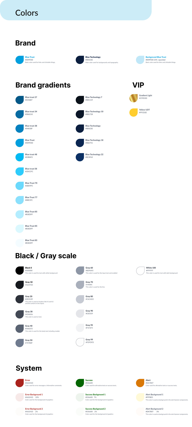
Components and Highlights on the app: Define a color palette and adjust the font size for better accessibility.
My role
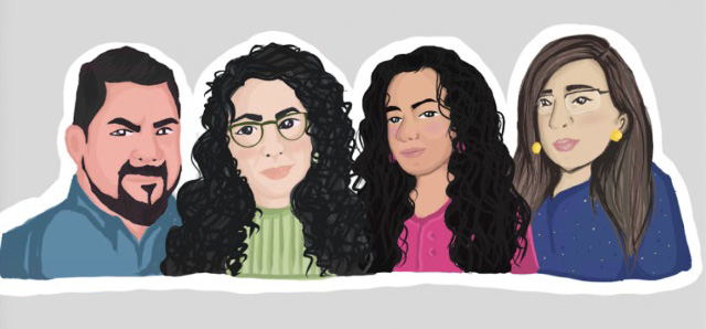
Lead the UX/UI team within the newly created Product area. Define and implement a UX strategy with the challenge of being the first time that a design system will be implemented in the organization following a user-centered design process with research to empathize with users, define, ideate, prototype and evaluate the design solution providing the development team a Handoff on an agile framework. In the team I had the help and collaboration of Dikshita Basu (Product Designer), Zashel Lara (Sr UX Designer) y Martha Torres (UI Visual designer).
Responsibilities
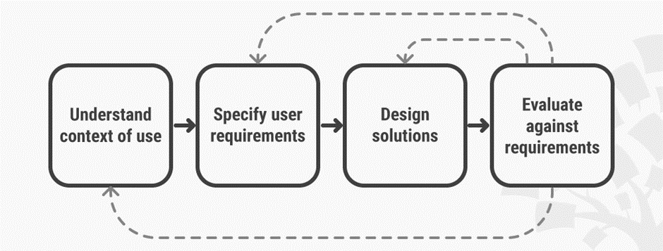
Define the strategy, roadmap and planning of SCRUM Sprints taking into account the time limit for deliverables. This would be the first time in the organization that we would follow a design thinking process starting with the empathize phase by conducting research, later leading co-creation and co-design sessions to define the solution, assigning tasks for team members assuming ourselves as researchers and designers building wireframes, interaction design and visual design using a recent design system created by the team, then prototyping and running rapid usability tests to validate variables across screens, scenarios and the design solution. Finally provide the development and QA team with everything necessary for the code build taking advantage of a technology revamp in phases in the organization.
Challenges
We had just a few weeks to go through a whole design thought process that included rapid research to understand the context, empathize with the users using the platform, and design and implement a whole design system, something completely new within the organization.
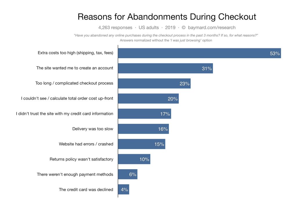
A 2021 quantitative study of cart abandonment reasons found that 7% of users had abandoned a checkout in the past three months because the site did not offer the desired checkout option.
In several rounds of payment testing in the reference study, the mere act of presenting multiple payment options without carefully designing the user interface of the payment method selector can introduce complexity into the payment process and may lead to choice paralysis.
Delivering an effective design solution in an organization with a low UX maturity level that does not understand the value of UX and design thinking.
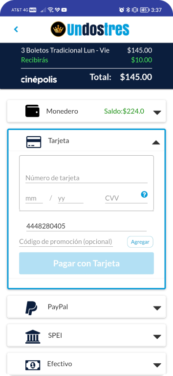
Examples of screens from the previous version.
Empathize
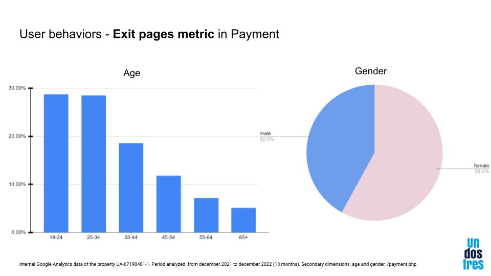
In the first phase, we focus on analyzing the existing data in Google Analytics, in existing studies, in industry reports (secondary research) and user behavior on that payment method selection screen. We found data that allowed us to test assumptions in a parallel study to define the people who used the platform and made conversions. We obtained quantitative data that allowed us to establish a strategy to design on specific screen sizes, for specific users and understanding good practices in design patterns for this particular phase in a checkout process on digital platforms.
Internal Analytics
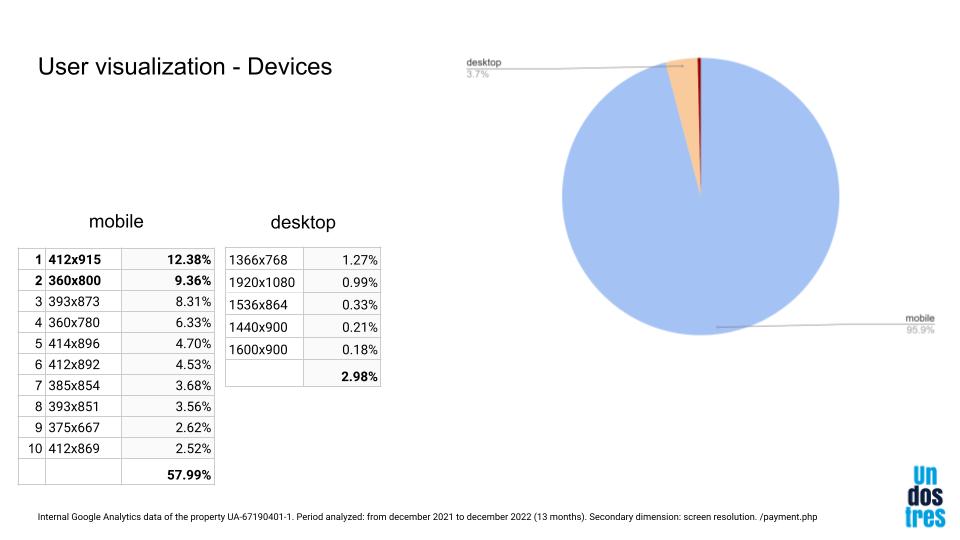
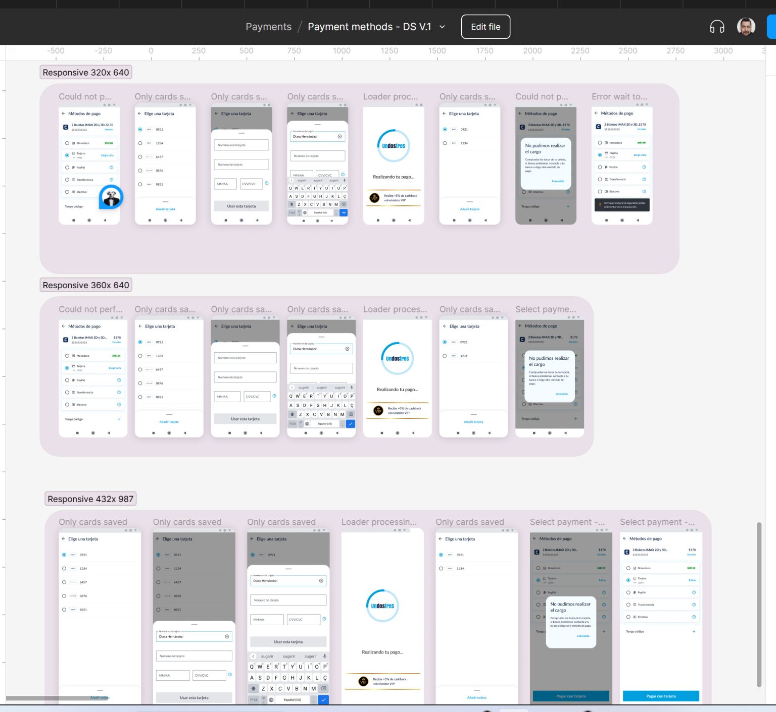
We looked at the quantitative data from Google Analytics and this gave us findings that helped us define the strategy, for example, the average screen resolution sizes for most users and working on that frame size in Figma.
Benchmark
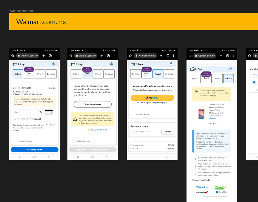
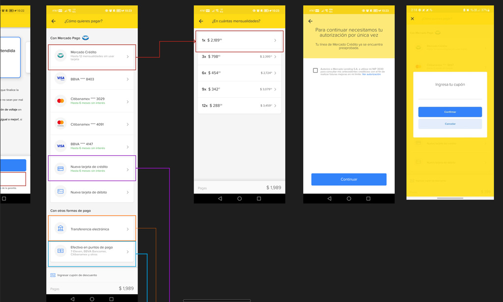
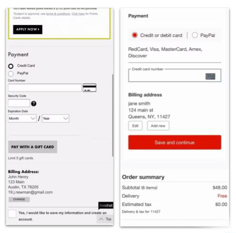
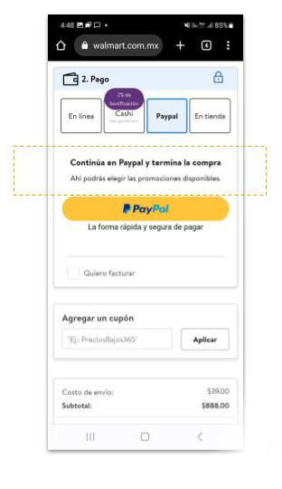
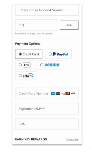
We also benchmark to find common design patterns and components across peers and competitors. We capture the information in a Google Sheet and take screenshots of your purchase process flows and the payment method selection step. We did it to understand the context in the market in Mexico. Here are some sample screenshots.
Primary research
Creating the model consisted of structuring the problem in order to prepare for subsequent research. This structure is the basis of the scientific method.
For this investigation I had to decide between two types of reasoning: deductive reasoning and inductive reasoning. We decide by inductive reasoning, collect the data first, then conclusions are made based on those data.
First we start with a compelling theoretical framework that can largely explain the situation we are studying. We then fine-tune our approach by comparing this framework and the real-life situation that is the subject of our study.
In this inductive study, designing the protocol also required careful decisions, involving less foresight because there is so much we «don’t know yet»; we had to wait to hear what the participants had to say before beginning the analysis. The challenge is collecting the right amount of data to get the full picture. Here, the analysis comes after the data collection. And yes, it takes a long time, especially since «too much» data was collected.
Executing a discovery phase that included instruments, artifacts and methods from User Centered Design Framework to build the User Personas of the VIP UnDosTres product.
Qualitative data collection
- 9 skateholder video interviews
- 9 users video interviews.
- 9 users audio interviews.
- 18 empathy maps.
- FODA & goals
- Theme Matrix.
Quantitative data collection
- Reports by Google Analytics.
- 2 Surveys and interviews.
- 2 reports by BI Analitycs team.
Secondary Research Insights
Third-party payment options that direct users to the third-party site will require an explicit description of the following third-party flow along with customized primary button.
Beyond having the most popular choice as the default selection, the interface needs to account for the fact that each of the payment methods will have different fields, descriptions, and even flows associated, which are only relevant to users who select that one payment option.
It was clear that how different payment methods are presented to users has a large impact on how easy it is for the majority who still just want to proceed to pay with a credit card.
In fact, having “credit card” as the default payment method is particularly important as many users will not be familiar with third-party options.
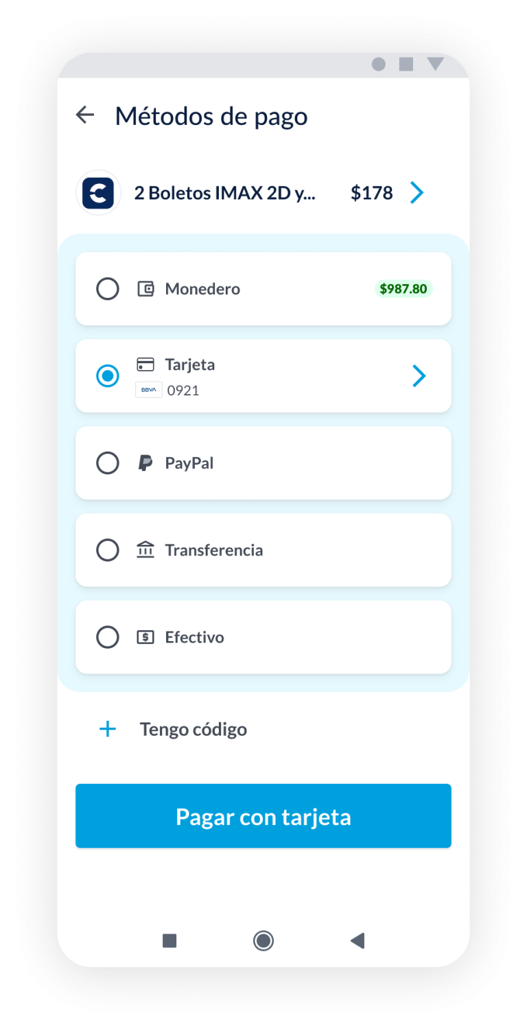
The optimal solution requires a progressive disclosure design, where only the description, fields, and buttons for the selected payment method are shown to users, and all content for the non selected methods is collapsed.
Define & Ideate
This phase started by creating the problem statement that would guide us and keep us focused when defining the solution. At this point the whole team already understood what was best for our users and it was time to brainstorm.
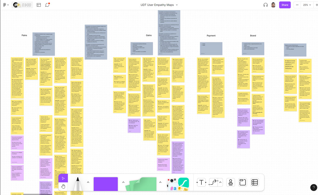
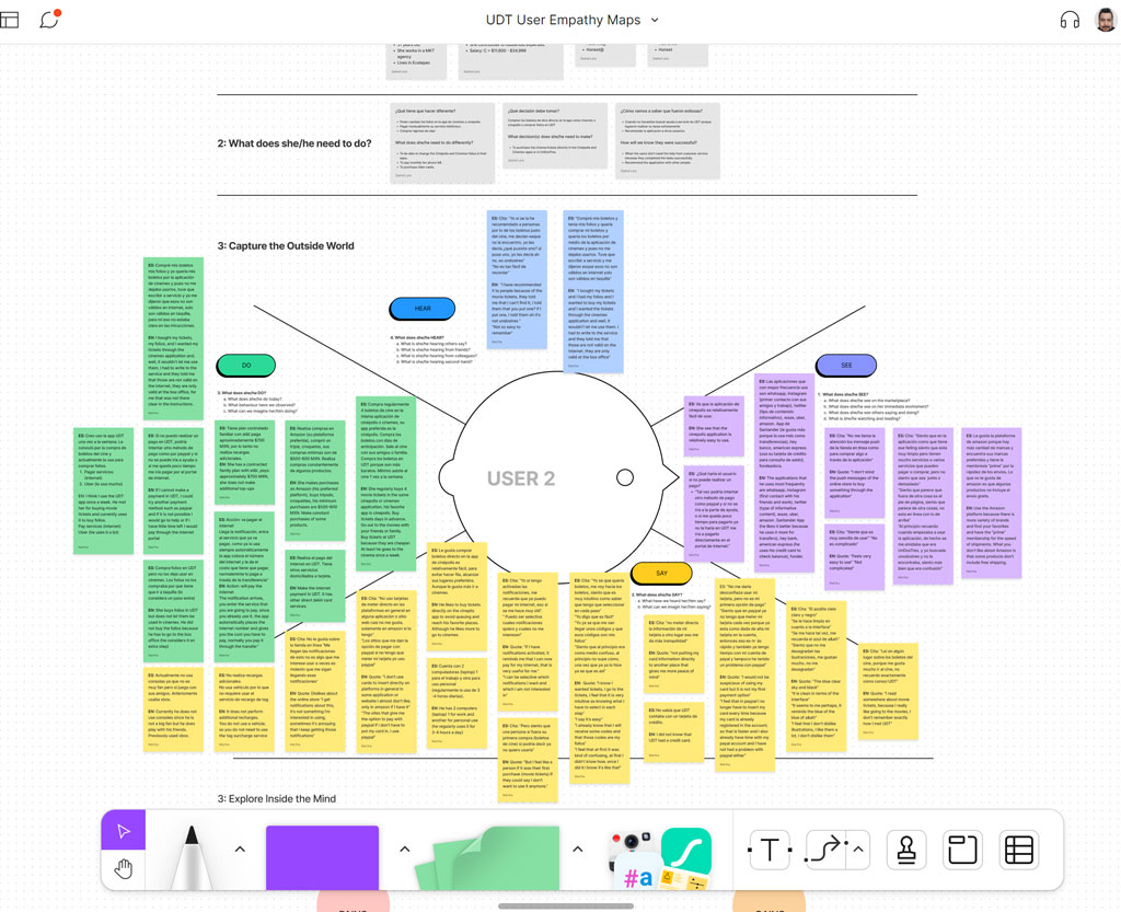
Organize data and Empathy Maps
I gave myself the task of looking for patterns in the research data and mainly from the interviews with users in the parallel project of user research. The team then developed different empathy maps that shaped the problem statement, user stories, and role-based Personas.
Personas
Who are the main users who use the platform and make conversions?
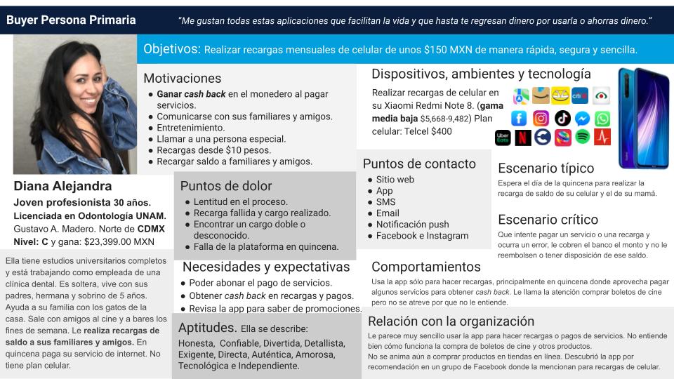
Here we base ourselves on the user research that we carried out in the team in a previous project in which we made a customized research model with the collection and analysis of quantitative and qualitative data in which the main outcome was the user records in the platform. This is an example of Main Person.
Diana Alejandra is a young professional woman who is independent and supportive, playing an important role in her family, providing financial support, and actively participating in decision-making.
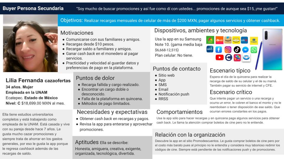
Lilia Fernanda stands out for being a bargain hunter, always attentive to savings opportunities and seeking to obtain the best economic benefits. Her focus on personal finance and efficiency in expenses reflect her prudent attitude and desire to maximize her resources.
In summary, Lilia Fernanda is a young professional woman who is thrifty and dedicated to taking advantage of offers and promotions to optimize her expenses. Additionally, she plays an important role as an employee at UNAM and maintains a stable relationship with her partner.
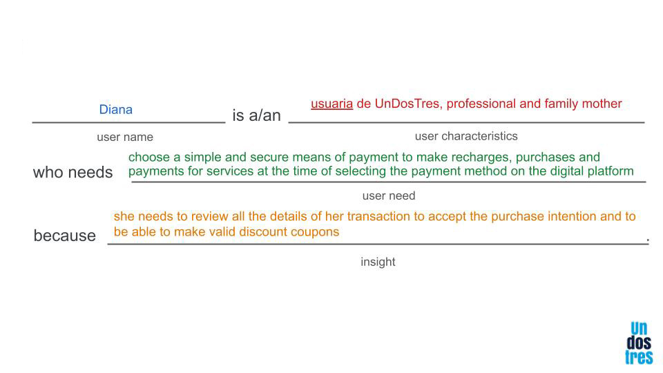
Problem statement
User stories
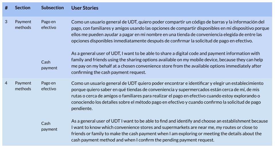
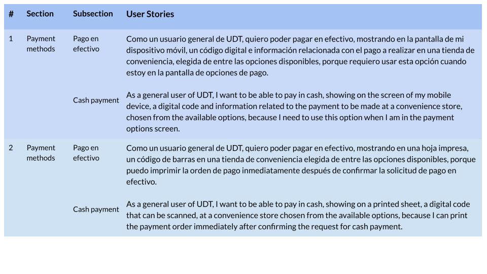
For each payment method variable and each functionality, I defined the user stories in a INVEST format in this epic and prioritized that these stories be fulfilled in the deliverables of each Sprint. Here are some examples of it.
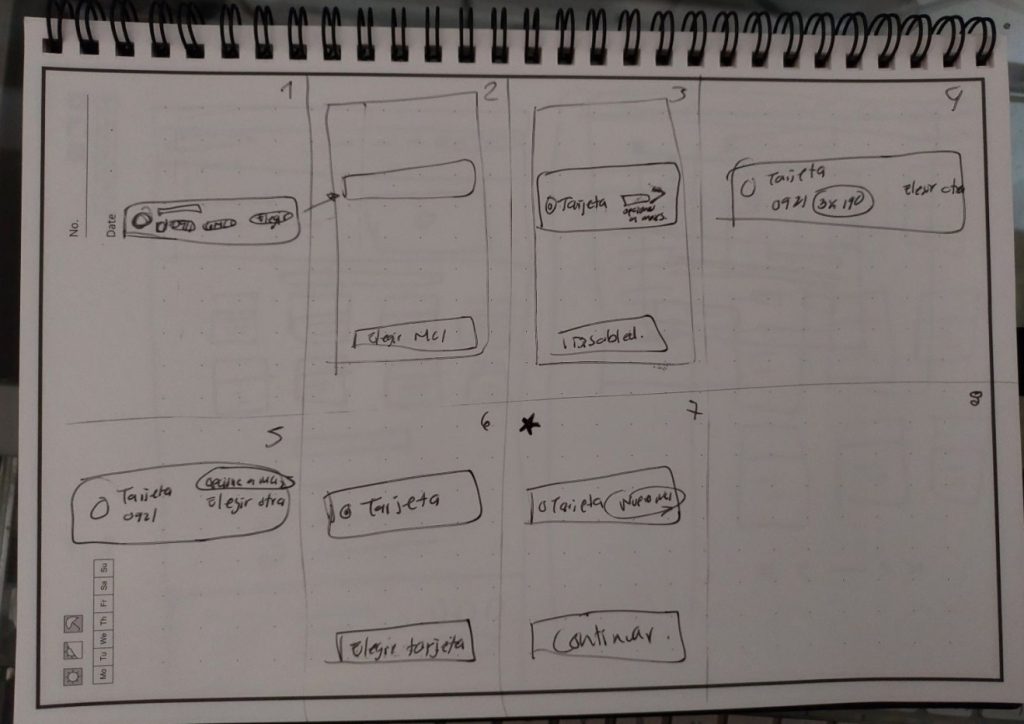
First sketches and wireframes
We did many iterations on the early sketches in low and medium resolution. Variables and problems constantly appeared that forced us to constantly iterate to obtain a structure that met the majority of expectations and contemplated all variables such as position of error messages, help such as question marks, new payment methods that would come in the future and other considerations. In this phase we carry out rapid prototypes to quickly validate them in guerrilla tests.
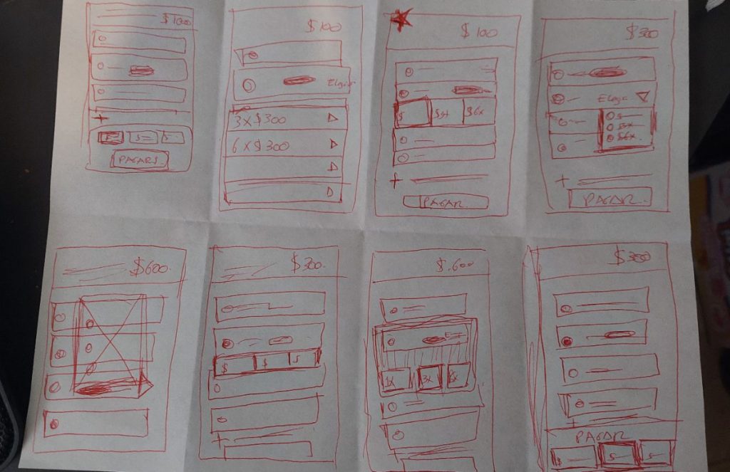
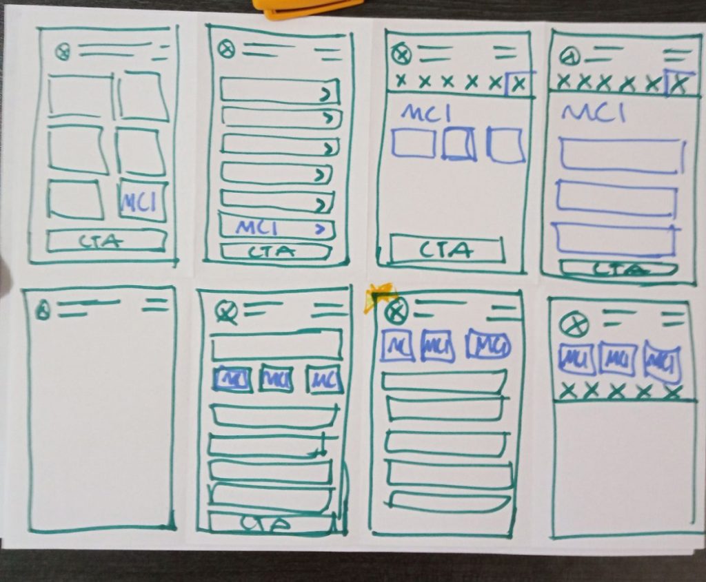
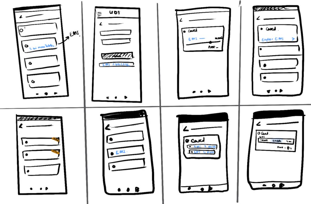
Crazy Eights
In different home office co-creation sessions (remote) we use this technique to define new component positions, such as the option of monthly payments with interest when selecting a valid credit card. Here are some examples of those exercises.
Prototyping & Mockups
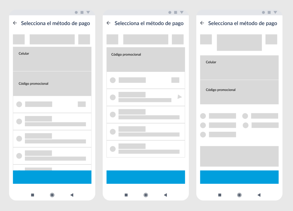
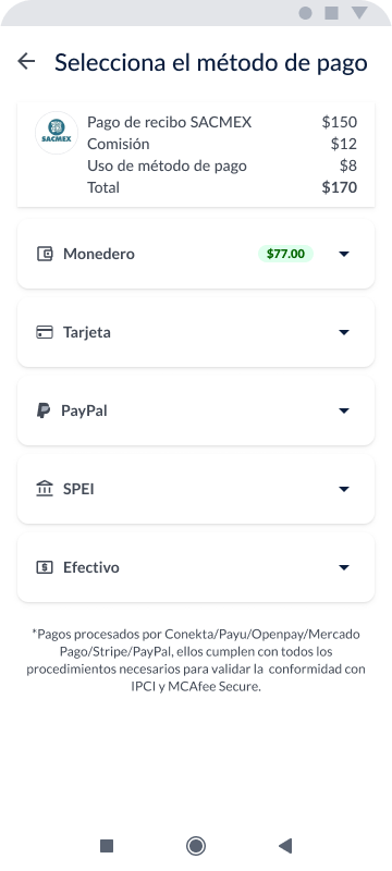
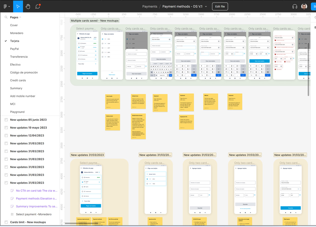
At this stage, we did several iterations of how the interface should be structured so that it is usable, accessible, and contains all the research findings. These are examples of preliminary iterations.
First iterations to define the architecture
Design System
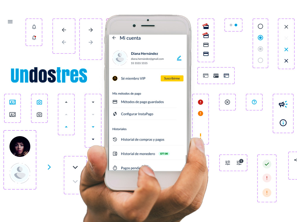
In a parallel project, the team led by UX designer Zashel Lara built a design system based on an atomic design strategy and based on Google’s guidelines and its Material Design 3. But incorporating our MVP BrandBook and MVP of the Voice and Tone manual adapting it to the needs of UnDosTres
Research insights and the results of a robust design thought process were beginning to become tangible.
The UX/UI team faced several challenges when building the design system for the startup. Our process involved the following stages:
Initial research: We began by understanding the startup’s vision, goals, and values. We conducted market research and analyzed the competition to grasp the company’s context and user needs.
Defining design principles: We established clear design principles that reflected the brand identity and provided a solid guide for design decision-making. These principles focused on usability, visual consistency, and adaptability as the company scaled.
Component library development: We created a library of reusable components that included common interface elements like buttons, forms, and cards. This ensured visual consistency across screens and expedited the design and development process.
Designing patterns and guidelines: We defined design patterns to establish a consistent structure in the interface and provided detailed guidelines on component usage, typography, colors, and spacing. These guidelines ensured consistency and facilitated collaboration within the team.
Iteration and ongoing collaboration: We maintained an iterative and collaborative approach, regularly seeking feedback from team members, stakeholders, and users. These inputs allowed us to refine and enhance the design system over time.
Documentation and delivery: We documented the design system in a comprehensive guide that encompassed principles, components, patterns, and design guidelines. This documentation ensured that all team members could access and effectively utilize the design system.
In summary, the UX/UI team conducted thorough research, iterated on designs based on feedback, and built a library of reusable components to create a robust design system for the startup. This approach enabled a consistent interface, an enhanced user experience, and efficient collaboration across the team.
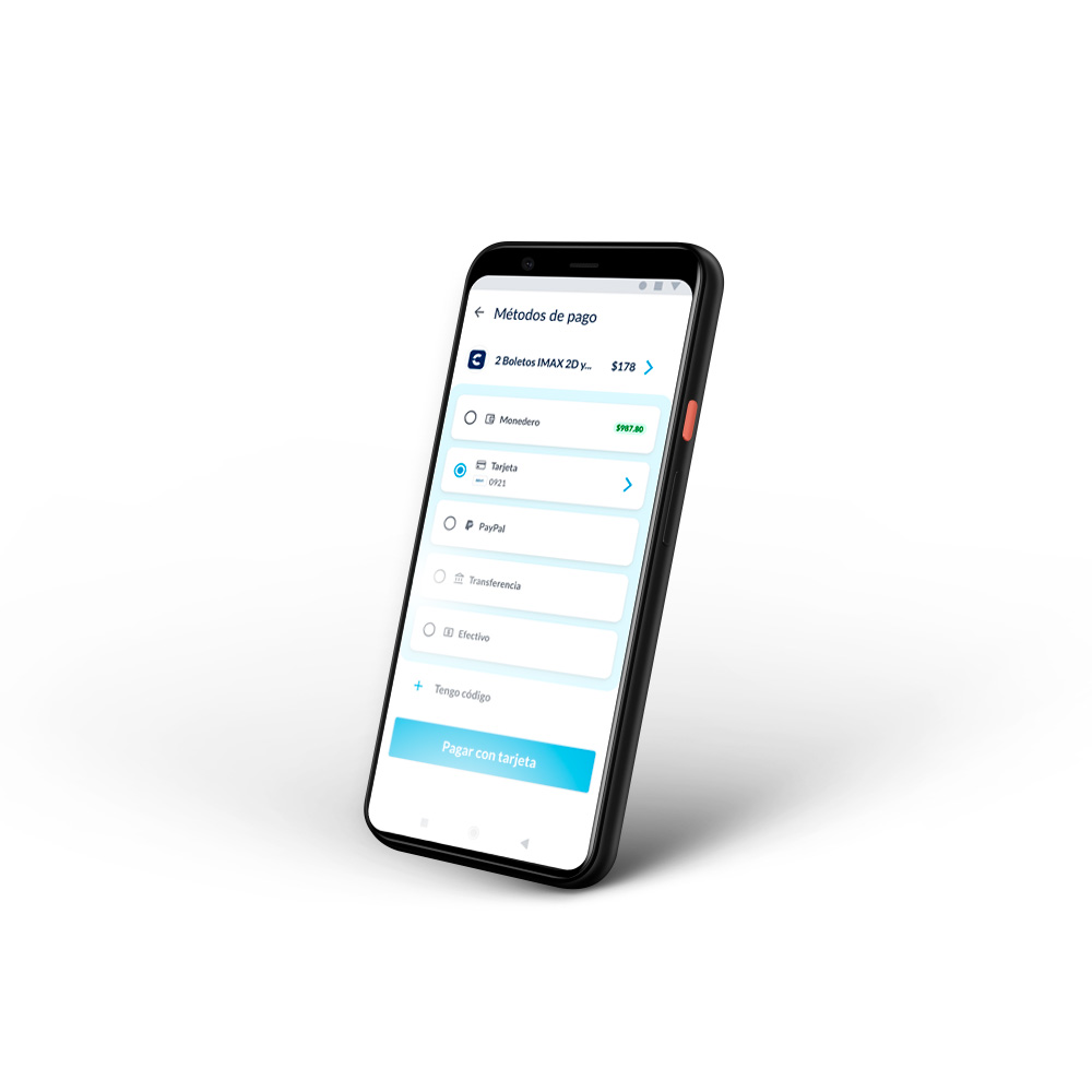
Defined the goals of the user flow: We established the clear goals that we wanted to achieve with the checkout process in the app. For example, guaranteeing an intuitive, fast and secure payment method selection, and minimizing process abandonment.
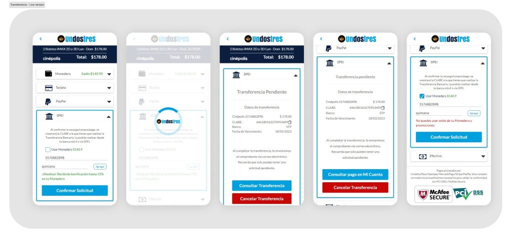
Previous version - Payment by transfer
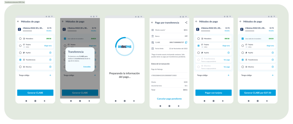
New version - Payment by transfer
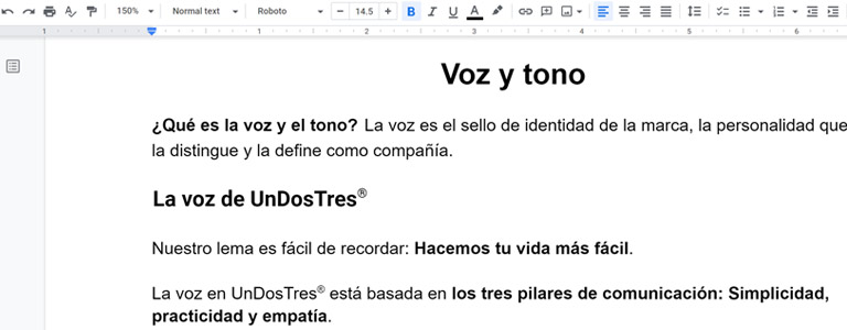
Voice and tone
Another challenge that we overcome along the way was the adjustments to the texts, those that precede the action, during the action and the feedback and error messages. Sticking to the usability heuristics and the MVP of Voice and Tone that the UX/UI team also worked on in parallel.
The voice is the hallmark of the brand, the personality that distinguishes it and defines it as a company.
The voice in UnDosTres® is based on the three pillars of communication: Simplicity, practicality and empathy.
The tone, on the other hand, is the reflection of our voice. While the voice remains stable for all the products and regions in which we operate, our tone can vary.
People who use UnDosTres® want to read information about products and services that is easy to understand, instructions that are quick to execute, and that solve their problems instantly.
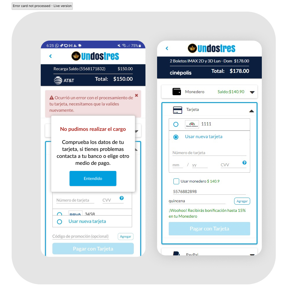
Previous version - Error processing card payment
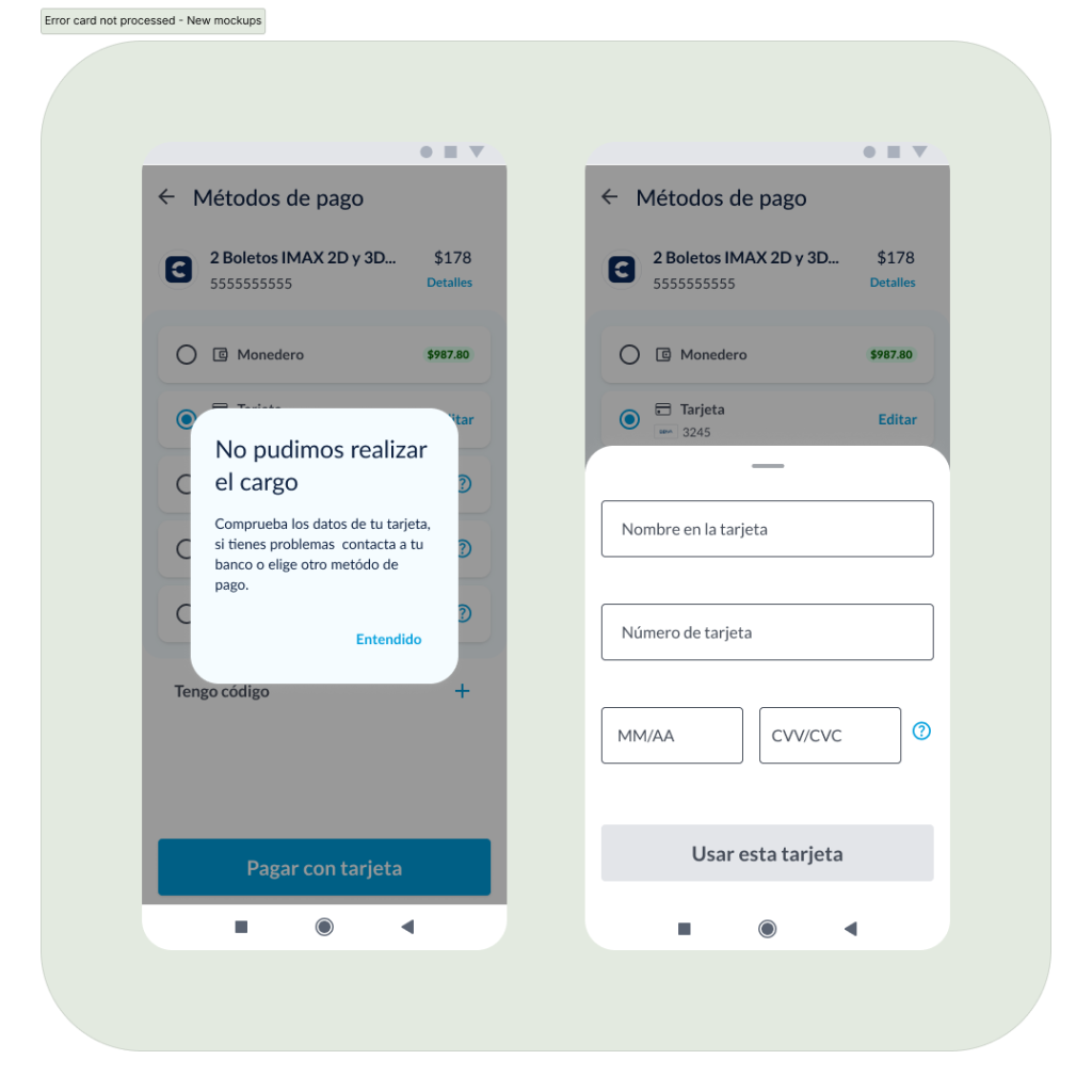
New version - Error processing card payment
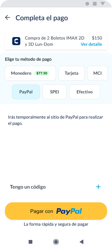
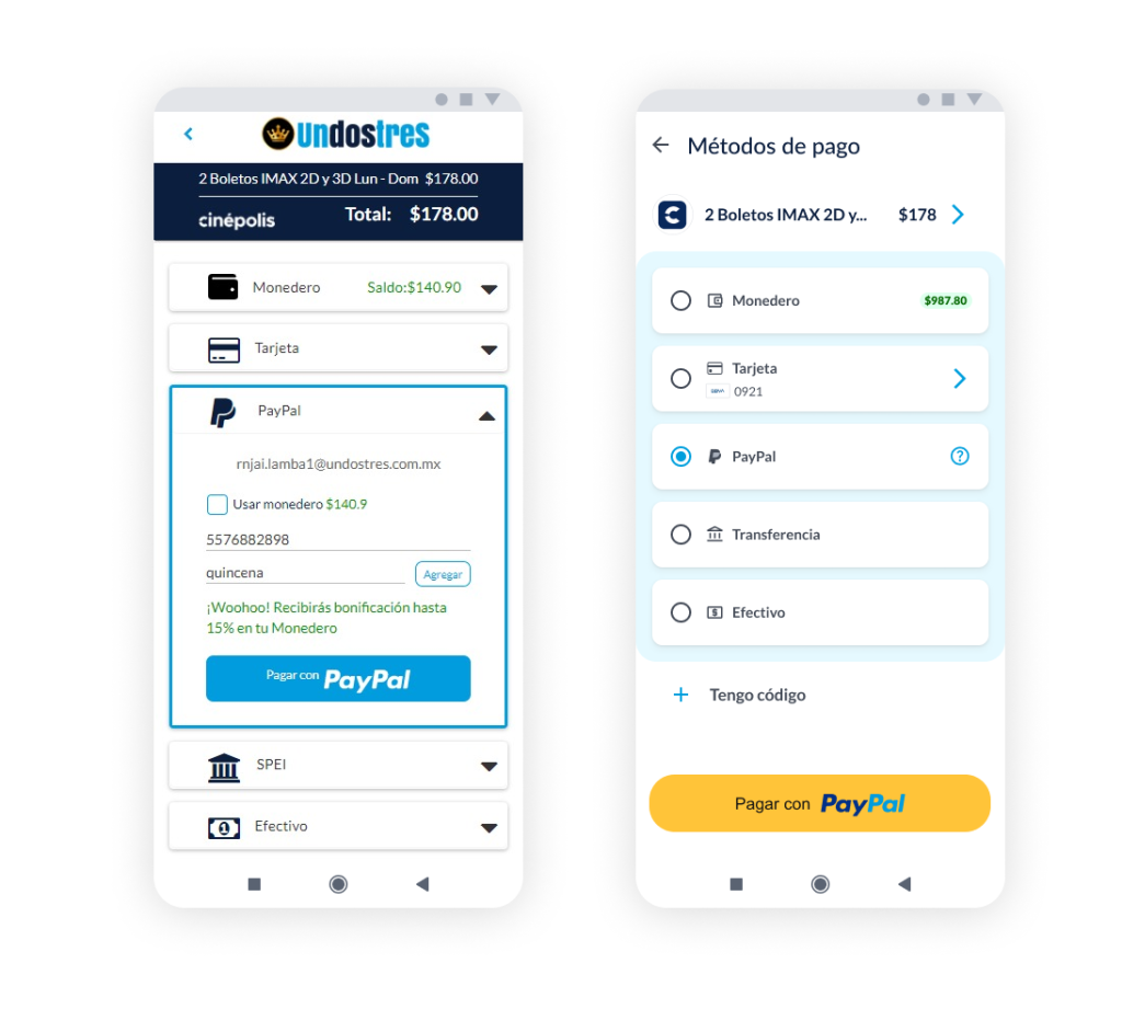
Payment with paypal the first time - Comparative old VS new version
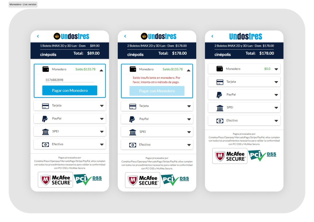
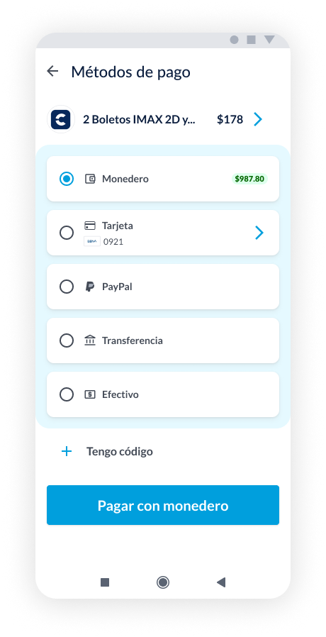
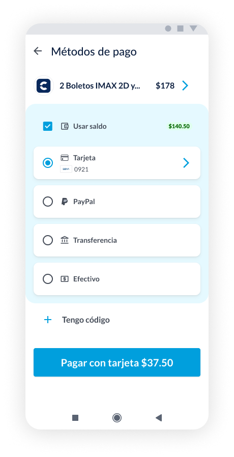
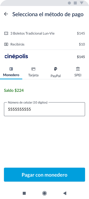
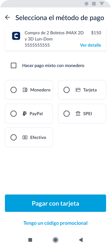
Payment variables with wallet
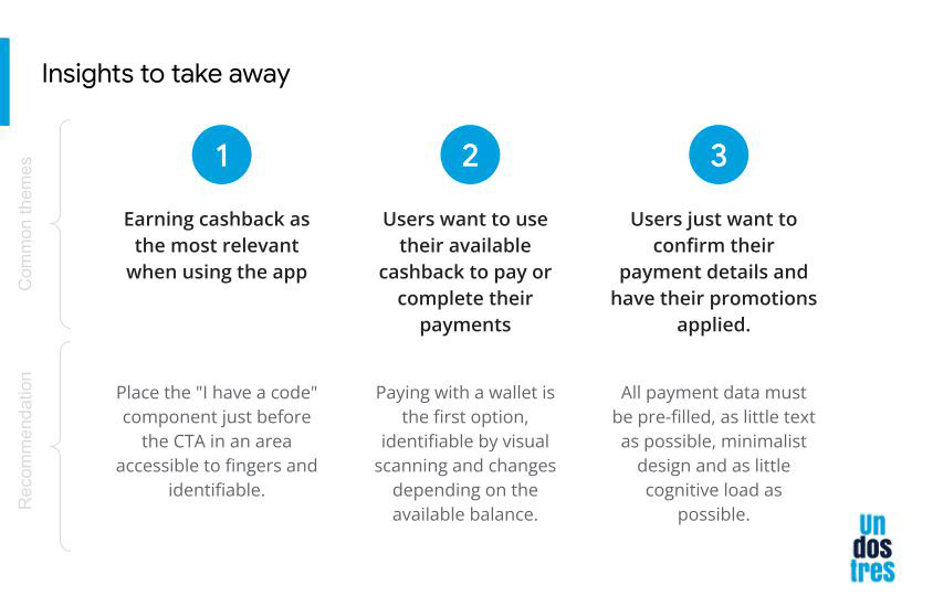
Users want to use their available cashback to pay or complete their payments. Paying with a wallet is the first option, identifiable by visual scanning and changes depending on the available balance.
User flows
- I define the purpose of the flowchart.
- I identify the key stages of the process.
- I create a visual structure using boxes and arrows.
- I add relevant details in each stage.
- I evaluate the clarity and coherence of the flowchart.
- I gather feedback from stakeholders and the design team.
- I update and improve the flowchart based on the received feedback.
Handoff
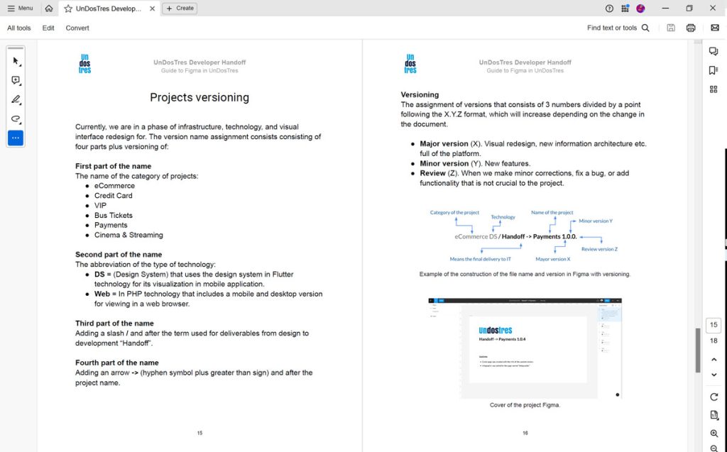
To provide everything necessary for building in code, we created a process and documentation to explain how developers can interpret the figma files, get the assets, measurements, code snippets and guides in the Handoff document and notes in the Figma files. To review the document, click the button below.
Part of the Handoff for TI team
Test
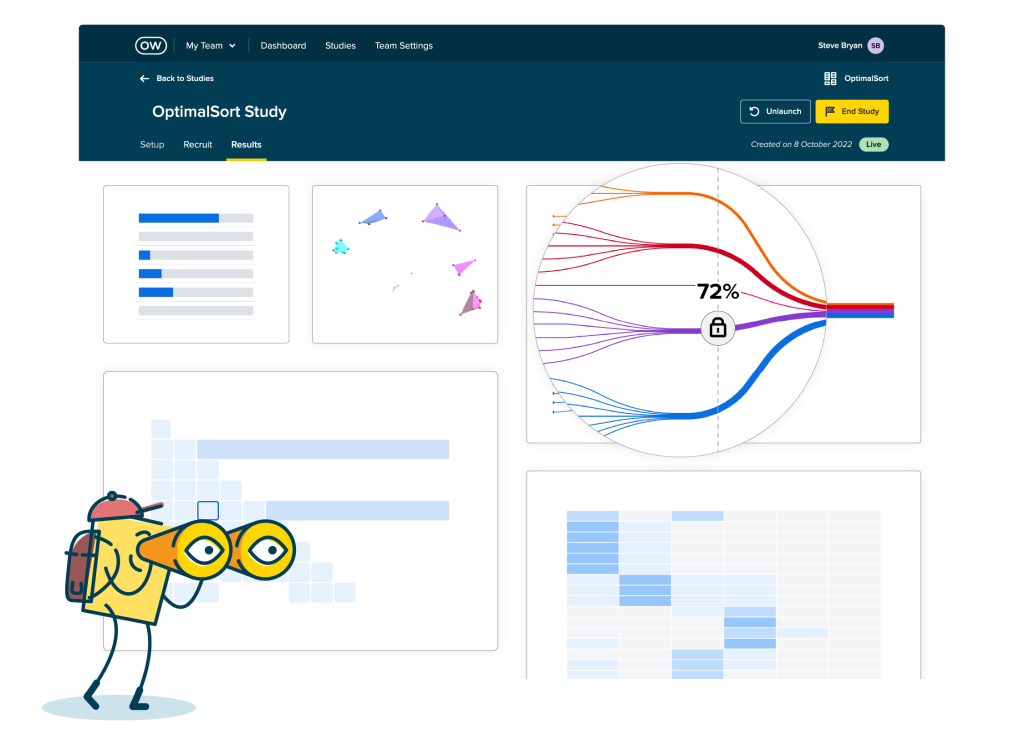
We test our prototypes and mockups on the Maze and Optimal Workshop platforms with a database of real users. We perform the exercises following good usability testing practices and we avoid possible biases to the greatest extent.
The results allowed us to iterate the prototypes until confirming with 3 variables: efficiency, effectiveness and satisfaction, the optimal results to build all the necessary flows and screens to carry out a hansoff with the development team.
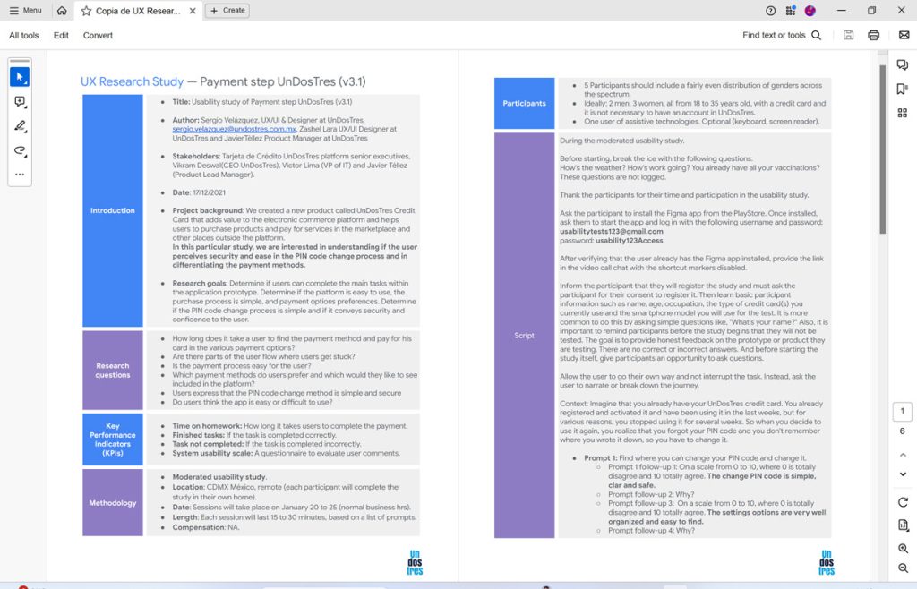
You can see an example of the plan and script of the usability studies carried out in the team by clicking on the following button:
Learnings
The achievements
This project has been a true professional challenge since we use all our knowledge, experience and skills at all times and always sailing against the current, against «there is no time for research», «there is no time for validations», «there are no resources for this…». We consolidated the UX/UI team in the organization as a highly valuable asset and a group of designers who did things differently from the rest.
This project is the result of other previous or parallel projects that the organization never requested but that we decided to do within the team without compromising deliverables, time or unassigned resources. we just followed a design thought process because it was our obligation/passion as UXers.
The project is now in the development team’s priority backlog awaiting its build into code. We will see if the results are as expected. Therefore, the development team is very satisfied with these deliverables.
What we can improve
We would have liked more time and resources for a more thorough generative research and validation phase.
Obviously, the team would have liked the entire flow to be addressed and not only the payment method selection process, but it was the business’s decision. In fact, there were many business decisions that we had to align with and that demonstrated a very low level of maturity in the organization with respect to the value of UX in participation and freedom in making business decisions. It is part of the reality of being in a StartUp. It is a learning experience for them and for our team. It is a great experience for me in team management.